Saturday Morning Musings
Saturday December 3, 2011
It’s another Saturday morning over here in Taipei. It’s quite a different kind of day in that the sun is supposed to shine all day and the temperature has plummeted. I can sense Canadians rolling their eyes (one Canadian in particular), but it’s true. It’s quite cold here in Taiwan at the moment – outside and inside. I’ve got my heater plugged in and that makes my living room nice and toasty. Without the heater, I wouldn’t be able to sit here.
I’ve got a hot cup of coffee in front of me and Moby’s new album “Destroyed” playing over the computer speakers. I haven’t decided what my plans are for the day. Since the sun is out, it would be a nice day to go for another “legendary scooter ride” through the mountains. I’m kind of in the mood to stay put, though, and fill the day with Taipei activities: an overdue haircut to start, then a trip to MOCA. I went to MOCA last weekend, but they were between exhibits. The new exhibits are now installed. At NT$30 or NT$50, MOCA is one of the great bargains in Taipei. I believe there is a new exhibit at the Huashan 1914 Creative Park, and I could check that out. What I would like to do is see something at one of the venues at the National Chiang Kai-Shek Culture Center. This is the official name for the cluster of buildings at the Chiang Kai-Shek Memorial. There are a few performance halls there: the National Theater, Experimental Theater, National Concert Hall, and Recital Hall. I have been to exactly none of them. I never quite understood which building was which or how one got tickets. I never looked into it, either, because I thought the ticket prices were out of a normal person’s reach. However, I’ve learned recently that there are cheaper tickets to these places if you are willing to sit in the back somewhere.
Another reason I never went is that their programs are very complicated and off-putting. I’ve often picked up one of their thick monthly programs and then after flipping through it once, tossed it aside and away. It takes an effort to fight your way through the layout and figure out what is going on. I know now that it isn’t that complicated. Hmm. I think I have my program for tonight – assuming there are tickets available. At the Experimental Theater, there is something called “2011 Young Stars New Vision”. It’s hard to tell what it is exactly, but it appears to be a dance performance mixed with drama. Being a dance performance, I don’t have to worry too much about everything being in Chinese.
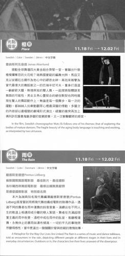
Seeing modern dance appeals to me. I enjoy modern dance very much despite having seen very little in my life. I recently saw a couple of dance movies at the Spot Taipei Film House. One was called “The Rain.” It was a Danish production and choreographed by Pontus Lidberg. The Spot schedule describes it this way: “A Metaphor for the Way Our Lives Are Linked. The Rain is a series of music and dance tableaus, told as encounters in the rain, depicting different people at different stages in their lives and in everyday circumstance. Outdoors or in, the characters live their lives unaware of the downpour.”
I was, as they say, blown away by The Rain. It’s a very simple story of a group of people connected by love. They meet in parks, in coffee shops, on the street, and in their apartments, and dance either by themselves or in pairs. They’re trying to communicate through their dance. I was mesmerized by their movements. It somehow got into me and I felt that my body was light and strong and capable of all those movements. It came as a somewhat unpleasant surprise that when the movie was over and I got up out of my seat, I still had my old body. I didn’t feel light and powerful at all anymore. My knees ached and my back was sore from sitting in that chair. And with my thick clothes and heavy knapsack and leather loafers, I could only stumble and shuffle and heave myself along.
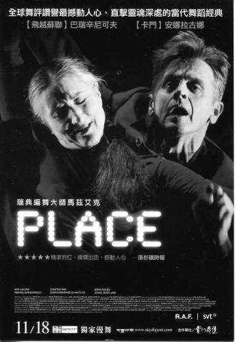
There were two dance movies that night. The other was Swedish. It was called Place and featured two dancers: Ana Laguna and Mikhail Baryshnikov. Again from the program: “In the film, Swedish choreographer Mats Ek follows one of his themes: that of exploring the bodies of mature dancers. The fragile beauty of the aging body language is touching and exciting as interpreted by two virtuosos.”
I’m not sure why all the descriptions focus on this theme of “mature dancers” and “aging body language.” I didn’t get that all. The two dancers happened to be older than the dancers in “The Rain”, but I didn’t get the impression that that mattered at all. The dancers could have been eighteen years old, twenty-eight years old, or forty-eight years old and it would have been the same to me. I thought – to put it naively – that it was awesome. I thought it was incredible and a huge amount of fun. Ana Laguna in particular was a revelation. She seemed nuts and scary at times. Her face was so expressive, not to mention her dancing. This was modern dance, so it might not be everyone’s cup of tea. You know it’s not Swan Lake when the set consists of one table and a big square of white carpeting. These two dance movies are gone now, but if they were still playing, I’d go back again.
The rest of the month at the Spot is taken up with a series of art movies from Japan and then a Latin American film festival. I’ll likely go to see a bunch of these. I’m curious what the Japanese films are all about, and I know I’ll love the films from Latin America. I wish the organizers of the festival had a pass for all of the films. There are an incredible 26 films from 17 countries. Individual tickets are NT$200, which is about US$6.50. That’s reasonable, but to see all the films would cost $170. I saw in the program that there was a ticket price of NT$1,800 (US$60). I hoped that was for a pass, but it was actually just for 10 films. So you would only save NT$20 on each ticket. That hardly seems worth the effort of having the pass. I can’t imagine anyone buying one of those passes.
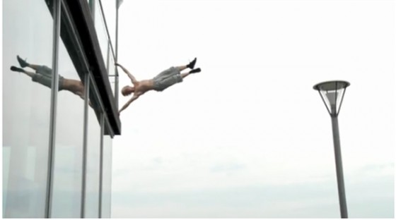
I also went to see a film about parkour called “My Playground.” I knew nothing about it. I just had happened to see some footage showing people doing parkour in cities around the world. Unfortunately, it showed very little parkour. It was a documentary about parkour and it seemed to be mainly about architecture and housing developments. I say “seemed to be” because it was all in Danish and there were no English subtitles. I forgot to check beforehand. I’m sure all these people standing around models of housing complexes and talking were saying interesting things, but since it was in Danish, I didn’t glean very much. And the parkour itself was not that impressive to me. There was a lot of running. And then more running. And I knew that the various scenes were shot in different cities around the world, but the character of those cities didn’t come across at all. It all looked roughly the same to me. Perhaps that is how cities look from a parkour point of view – cement, metal railings, and pedestrian underpasses. I was expecting more along the lines of the parkour scenes in the latest James Bond movie and the latest Bourne movie. These showed the character of the countries and the cities they were in – and they were very exciting. Other than the establishing shots in “My Playground”, I really didn’t get the impression that these people were in other countries.
Even though I was not feeling particularly moved by “My Playground,” the film did make an impression on me. I found that when I left the theater and walked down my alley to my apartment, I noticed all the concrete fences and ledges and doorways around me and I found myself looking at them from a parkour point of view. I was instinctively trying to see how I would scale them, climb up them, jump from one to the next. In a way, I found myself seeing them for the first time. And that, perhaps, is what parkour is all about – seeing your everyday environment in a new way.
Much of my week was also taken up with the technical side of this blog. I don’t feel like I’m going about the learning process in a very efficient way, but I am managing to learn a few things here and there. I have sort of mastered the scary world of FTP. It is now quite a normal thing to me to simply log into my FTP client and then upload files to the server where my blog is being hosted. It’s not scary at all. It’s no more complicated than copying files from folder to folder on your own computer. The trick is in just understanding the basic concepts and then downloading and installed an FTP client – which is just the program you use to transfer files back and forth. The other trick is to know how to log in with your FTP client. This involves a very precise set of details including the proper protocol, password, username, and port. All of these things, I found out, are provided by your hosting service. When I first downloaded the FTP client (I’m using the free client Filezilla) and saw that I needed a username, I didn’t know what that was. I assumed I’d have to choose a username, but I saw nowhere where I could choose one. The truth was that I already had a username. This was created automatically by the hosting service when I signed up for an account. I had to sign in to my hosting account and then track down this information there for my domain name. None of this information was very clear and I had to figure it all out by trial and error.
I also managed to fix some things on my blog that were not working. There was a featured called the Default Thumbnail. This was part of my theme which I had purchased. If a post does not contain any images, then this default thumbnail is supposed to be applied. I had chosen a default thumbnail and uploaded it to my blog. However, it was not showing up anywhere. I could see no way to fix this problem, and I contacted support for my theme. They happened to be right in the middle of doing a framework update (whatever a framework is), and somehow that framework update fixed the problem.
My greatest triumph was putting in place a set of Social Media links. You can see them on this blog on the right hand side near the top. It’s a series of icons for Facebook, Flickr, Vimeo, Twitter, and Pbase. One can click on those icons and be taken to those websites. Ninety-nine percent of this was done by my theme company, ColourLabs. They had a post on their company blog which gave the code for this and then instructions on how to install it. However, just doing that required a fair bit of knowledge. I certainly could not have done it even two weeks ago. And when the code was installed, it simply didn’t work. I didn’t know what was wrong, but when I looked at the code, I could sort of understand what was going on. I played around with some settings and when I adjusted the code for the background color, it fixed everything. I have no idea why. It just did.
I should say that the code that ColourLabs provided was just default code. It obviously wouldn’t work for my particular blog or set of social network links. Once the code was installed (in the style.css file and the sidebar.php file), I had to then find a set of graphic icons, resize them, and then upload them to my server using my FTP client. I then had to adjust the code to point to those graphic icon files on my server and then adjust the link URLs to point to my actual websites. This all worked out, but then I had two more problems. Clicking on the icons opened those websites in my blog’s window. I didn’t want that. I wanted them to open in a new tab or window. After a bit of research, I figured out the bit of code that needed to be added (target=”_blank”) and I added it to each line. Then I also wanted some text to pop up when the mouse was placed over each icon. I wanted there to be a short description of what each link connected to. The code for that is (title=”insert text here”). I inserted that line into each link and wrote the appropriate text. Then I adjusted the title of the section to make it a bit more personal. And I was done. I had a nice little line of icons pointing to my various sites on the Internet. It’s like everything in life I guess – simple when you know how and nearly impossible and terribly complex when you don’t. If I saw those little icons on someone else’s blog, I’d assume putting them in place required programming genius. It doesn’t require genius, but it does require a lot of knowledge.
With all of this I realized that a basic knowledge of HTML and CSS is essential. There is no way I’ll ever get to the point where I truly know how to work with HTML and CSS. However, just to understand what people are talking about when they try to help you, you need some basic grounding in this stuff. I have spent a lot of time reading about the inner workings of WordPress. However, I rarely understand any of it. And I think that’s because all of WordPress is based on HTML and CSS and all that stuff. You have to have a foundation of knowledge in that before you can begin to understand WordPress. So I took a step or two back and I’ve started to learn about HTML. I found a website called Quackit which has been helpful. It has a series of articles explaining the basics of HTML and CSS. I can’t say it is a perfect resource. It started out well and each article built on the previous article. However, at some point, it seemed to leap ahead and leave out a bunch of essential information. That always happens with this stuff. Still, I learned quite a bit, and I plan on going back and rereading all of the HTML stuff and then finding new resources to help me. Once I’ve gotten that under my belt, I’ll be able to tackle WordPress itself. I still think it is beyond insane that you have to know all of this stuff to do even basic things. I think it’s crazy that working with a blog or website has to be this complicated. The techniques involved are decades behind the techniques found in other computer-related areas. Just compare how easy it is to work with any layout software as compared to HTML. HTML is primitive beyond reasoning. However, it is what it is. And I have no choice but to learn a bit of this stuff.
The main thing I want to do now is come up with a simple way to have pictures in my blog posts. I’ve been playing around with a plugin in called SlickrFlickr, and right out of the gate, I’ve had problems. It seems ideal, but, like WordPress itself, it has baffling limitations and problems. As far as I can tell, when you insert photos from Flickr and put them in a slideshow or galleria, you can only have either portrait or landscape photos. You can’t have both together. Also, you only see square sections of your photos instead of the entire photo. Finally, the carousel of images to choose from sits on top of the photo itself and obscures much of the photo. No one seems to mind any of this and SlickrFlickr is a very popular plugin. Myself, I just can’t figure out why anyone would use it with those limitations. I keep thinking I must be using it wrong, but I can’t find a way to fix these problems. Anyway, I haven’t solved the WordPress picture problem. Videos also have been causing some problems. Gotta figure that out.
Anyway, enough babbling for this morning. Time to start the day.
Tags: Baryshnikov, ColourLabs, CSS, Experimental Theater, FTP, HTML, MOCA, parkour, Place, SlickrFlickr, Wordpress


